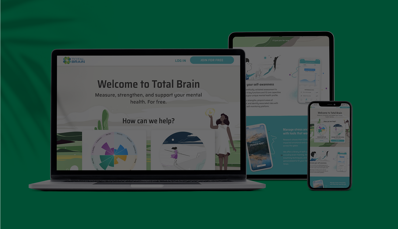
Total Brain: Registration
Redesigning the registration experience for 18% increased conversion
BACKGROUND
Total Brain is a mental health platform eligible to individuals through their corporate wellness program. Once registered, the app offers a scientific brain assessment, brain training exercises, and meditations to improve brain functionality.
MY ROLE
I was the lead designer on the team working alongside our content designer and contract illustrationist. I worked closely with product, sales, engineering, and was overseen by the C-Suite. My work consisted of user research, user flows, low-fi to high-fi designs, and usability testing.
THE PROBLEM
Our CS team was responsible for evaluating the registration numbers for several new accounts, and found that only about 15% of eligible usewrs were actually completing registration with Total Brain. In fact, they saw that there was a high number of individuals who visited the page, but they would leave without completing the sign-up process. We wanted to understand why this was happening so we could increase app registration and usage.
MY PROCESS
This was a high-priority project that accounted for a major business KPI. As a result, I wanted to ensure that we were solving the right problem, with research and testing throughout the entire project.

UNCOVERING THE PROBLEM
I led internal interviews with Marketing and CS to understand the process of how a user is introduced to Total Brain. While there was some nuance, we found that the main flow entailed a corporate HR email about the program, a session to learn more, and a second email describing enrollment. The process was quite disjointed, with limited explanation of what Total Brain was. In addition, this was paired with a bare-bones registration page that also offered little context into the platform. We decided to focus on the redesigning the registration page because it did not involve sign-off from the client which has historically been a long process.

Artifacts from internal interview.

Artifacts from internal interview.

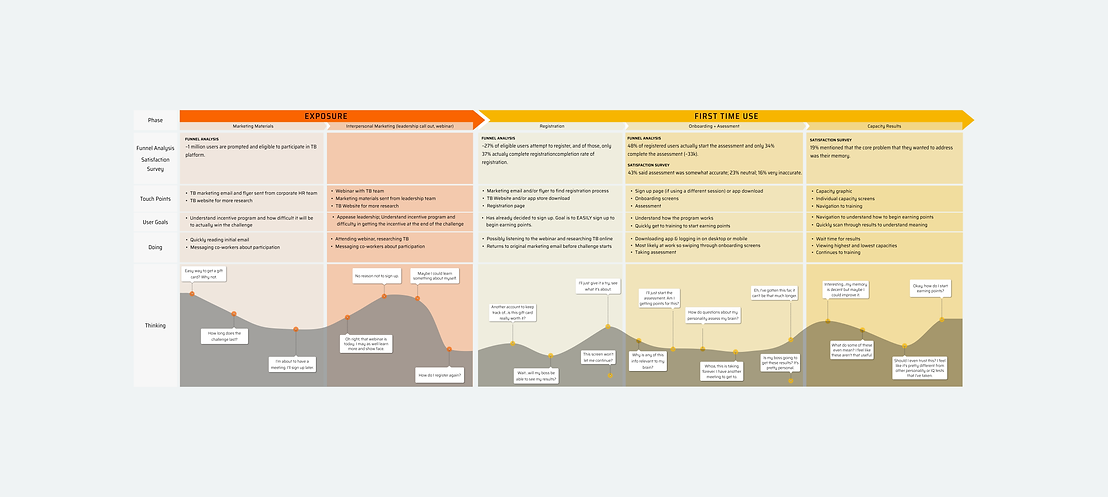
Journey map outlining the registration and first-time use of Total Brain.
EVALUATING THE CURRENT PAGE
In evaluating the current registration page, it was clear that the page lacked any sort of detail around what Total Brain offers and relies too heavily on the user. I wanted to better understand what users wanted to see, and collected user feedback through a set of unmoderated interviews on UserTesting.com. Additionally, I went through our Satisfaction Survey to collect any insight about the registration flow.

The two main insights we found was that (1) users want to see the effectiveness of the product, and (2) users want to see what they're getting before signing up.
I want to know more info about the program before I join. I can't find anything about what this actually is.
from UserTesting
I like to see testimonials about how a product has helped previous customers. I also want specific data points.
from UserTesting
I guess I didn't know what I expected when I signed up, but this is not it.
from Satisfaction Survey
Original corporate registration design.
DESIGN ITERATIONS
Based on the feedback, I sketched several different user flows to present to our C-Suite. From a previous project, we identified two different personas that accounted for why a person would sign up for Total Brain. I highlighted this separation in the design, creating two different paths mapping to each persona. Once the team was aligned, I created medium fidelity wireframes to begin testing with users on UserTesting.com. I went through several feedback rounds with our content designer and made design adjustments after each round. I've mapped some of the most informative feedback below.

Updated wireframes to test on UserTesting.com
INSIGHT #1: SCIENTIFIC IMPACT
Users noted that they wanted to see the science backing Total Brain and its claims to ensure that it was effective BEFORE signing up. For this, we worked closely with our science team to pinpoint the most compelling data for potential users.
I'd like to see some data and more research that this actually removes stress for users.
from UserTesting
INSIGHT #2: CONFIDENTIALITY
Since Total Brain is access through a users' corporate wellness program, users wanted confirmation that their mental health information would not be shared with their employer. Based on this feedback, I worked with our content designer to include this in our final designs.
How is my information kept private? I wouldn't sign up for this unless I knew, especially because it deal with mental health.
from UserTesting
INSIGHT #3: COST
This was the most interesting and surprising finding. Even though Total Brain was accessed through a users' corporate wellness program, users still assumed there was extra cost to sign up.
I'm assuming there are extra costs but I'd like to know what they are.
from UserTesting
What's the cost of this? I would definitely need a free trial to see if it's worth paying for. Usually these things are pretty expensive.
from UserTesting
INSIGHT #4: ACCESS WITHOUT SIGN UP
We found that users were hoping to gain access to the platform to ensure that they liked it before signing up. I suggested that we offer access to the assessment, at which point the user could sign-up to get their results.
However, in presenting this idea to our sales and executive team, they were hesitant to offer this because it risked a decrease in registration. We found a compromise, and offered users the ability to just preview our platform.


Brainstorming ways to offer access prior to signing up.
I'd like to be able to take the quiz before registering so I can gauge where I'm at and if I truly need this.
from UserTesting
Do I get a customized program? How does it determine what I need? I'd like to see that before registering.
from UserTesting
HIGH-FIDELITY RESPONSIVE DESIGNS
I worked alongside a contract illustrationist in order to complete the visual design and keep it consistent with the rest of our platform. I worked with engineering in order to deliver these designs in multiple sprints, attending standups to ensure that all questions were answered.

MEASURING OUR RESULTS
To evaluate the success of our designs, we ran a comparative analysis of the registration percentage for a new account after the redesign. We found an 18% lift in registration of eligible users from before the redesign! It was hugely exciting to see the impact of my work.

TAKEAWAYS
This project was exciting to me because it was very data-driven and therefore I could actually SEE how effective my work was. From the onset of the project, the team discussed our goal for registration, and therefore I was easily able to evaluate the results at the end of the project. I learned that introducing some way to measure your designs is crucial to showing the value of design and my work.
This project also reminded me the importance of user testing, no matter how seemingly small or scrappy the testing process may be. Going into this project, I thought the issues with the registration page were pretty clear (mainly, that it lacked information). However, after testing screens with users, it was shocking to see the difference that one detail, or one word (in this case, cost $$$) could make to the overall success of the project.
READ ANOTHER CASE STUDY:


